Villa Maya
mobile application designed for Villa Maya Restaurant enables users to easily book tables and discover the restaurant's latest menu offerings.
With this app, customers can conveniently plan their dining experience and stay up-to-date on the restaurant's culinary offerings.👨🍳
Please note that this is a self-initiated project to improve my skills and showcase my portfolio.
Book your table, savor the moment
🎨 MY ROLE
🔥 TOOLS AND METHODS
⏳ PROJECT TIMELINE
Entire product design from research to conception, visualization, and Interaction
Figma, Competitive Analysis, User Personas
2 weeks
Villa Maya
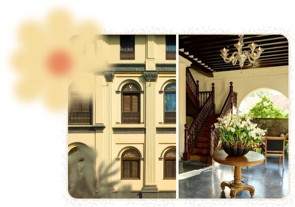
Villa Maya is an upscale World Luxury Award-winning restaurant(2018, 2019) showcasing global cuisine presented in an elegant, restored 18th-century home with a garden patio.
At Villa Maya, food is more than just the taste – It is, along with an exhilarating experience, a journey into the past. Not just the preparation, the presentation too reminds one of India’s rich cultural heritage.
Explore more about Villa Maya
Video Source : villamaya.in
Project Discovery
Why I created this App?
Although Villa Maya is an upscale award-winning restaurant, unfortunately, the booking system still follows a traditional approach where customers have to physically visit or call the restaurant to reserve a table. After personally experiencing this inconvenience a couple of times, I was inspired to create a mobile application that simplifies the reservation process for Villa Maya's customers.
Project Goals
Make the booking process hassle-free for the customers via App
Special menus, special offers, and menu items on the app
improves efficiency and profitability for the restaurant
Reduces the likelihood of errors and overbooking

Design Process
HCD Process
Once the product is established with core features, sub-tasks were done with the HCD process.
Why? Avoid UX Blasphemy(All the new features need not go through the same design process).


User Research
I created two personas to help me explore the needs of a larger group of users and design my app with specific target users in mind.
Anita Francis

University Student
Background
Anita is a college student who enjoys spending time with friends, She regularly visits Villa Maya with her friends and fell is in love with the ambiance and food. The only downside is that most of the time the restaurant will be fully occupied and she finds it inconvenient to make reservations through their traditional methods which will cost a lot of time and effort.
Reserve a table for friends
Check availability during peak time
View menu and offers
Learn about ambiance and cuisine
Receive timely confirmation
Goals
Inconvenient reservation process
Spend too much time on the phone booking a table
Limited information on specials
Uncertain table availability during peak hours
Frustrations
Aryan Raj
HR Manager
Background
Aryan is an HR manager who is responsible for organizing dinner meetings with clients and guests on behalf of the company. He often chooses Villa Maya Restaurant for such events due to the restaurant's great ambiance and popularity. However, the reservation process is tedious, and Aryan finds it time-consuming to make reservations through traditional methods.
Streamline the reservation process for large groups
certainty about table availability during peak dining hours
Enable online modification or cancellation
reduce the need for phone calls or visits to the restaurant
Goals
No online option to modify or cancel reservations
No online option to view menus or special packages
Long phone wait times for booking tables
Uncertainty about peak dining hour table availability
Frustrations

Competitor Analysis
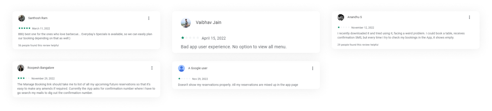
As Villa Maya is a leading restaurant in the city, I examined three luxury restaurants (O by Tamara, Paragon Restaurant, and Barbeque Nation) that are its direct competitors. To evaluate the user experience, I downloaded and analyzed the booking process of each competitor's app for both new and returning users. Additionally, I reviewed positive and negative feedback from the App Store and Android App Store to identify what are all the features users love, the most significant pain points users face while using the apps, and areas that require improvement.
From the initial experiences itself, I could easily find that two App interfaces and experiences were very poor. Only the Barbqqure Nation’s App was much better and I could see the positive effects from the reviews.

Information Architecture
To outline all the necessary functionality, I created a simple flow diagram of the main tasks the user can do. One of the flows is shown below.


Low-Fi
Wireframes
Following the research phase, I utilized information collected from market research, user research, and various UI inspirations to create low-fidelity wireframes of the primary user flow on paper. Without much effort, adjustments could be made before going into the much more costly digital implementation.

Setting the theme
Villa Maya is a restaurant with a rich heritage, tradition, nature-friendly, and luxurious experience.
The app should reflect these values instead of being a typical table reservation application.
The theme of the app should align with the style of the restaurant, which is royal, traditional, and luxurious.
The objective is to create a consistent and smooth experience for users.
Users should feel like they are using an extension of the restaurant.
Observations & Goals
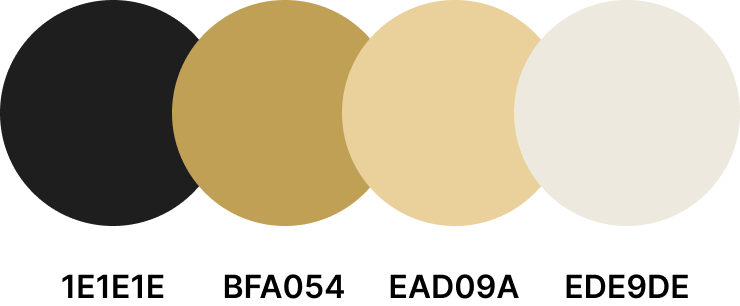
Color Palette
Inspired by the restaurant style

Typography
DM Serif Sans(Royal, Luxury look)
Inter(Modern, Simple)
& Typography

Login Page
Users have the option to log in to their account through either manual email entry, mobile number entry, or by using their Gmail account.
Home Page
The primary object of the users will be to reserve a table, the CTA is highlighted on the top for quick action.
Nav Bar:
Mainly for navigating through different sections of the product.Contents:
Contents are rich with Today’s Specials as first priority, and regular menus for the users to browseProfile:
Manage basic details like name, phone numbers, passwords, notification settings etc
Details Page
Users will be able to view additional details about the dish, such as a basic overview and the ingredients used in its preparation.
Favorites
Users can add any dish to their favorites listCTA:
Users can navigate to the "Reserve Table" section directly from the details page.
Reserve Table
The users can select a date and time for their reservation and specify the number of guests. Additionally, they have the option to add an extra table if their group is large.
Confirmation & Booking
After the user enters all the details, a final confirmation will be displayed to prevent any erroneous data or accidental clicks. Once the user confirms the data, a final receipt will be displayed, allowing them to share, modify, or cancel the reservation.
My Bookings
Users can access both upcoming reservations and a record of past and cancelled reservations (if any) under the "My Bookings" section.
Additionally, I have provided a filter to traverse more efficiently.
Alignment & Grid
I used an 8-point grid system and a 4-point vertical grid in the design to create consistency and alignment, making the interface more user-friendly and visually appealing. I set the margin and gutter to 16 and set the width of the grid to Auto. The components in the design also follow the 8-point grid system.
The app has been evaluated for contrast to match at least AA standards. Every screen was checked with the Figma plugin “Color Contrast Checker” which follows WCAG guidelines.
Project Summary
During the project, I managed to evaluate the market research, create a set of lo-fi wireframes, build them into hi-fi UI designs, connect them to a prototype, and perform a mini usability study. This was a demanding and time-consuming but very insightful journey.
During my career, I have primarily used Adobe XD as my design software. However, for this particular project, I decided to switch to Figma, which provided an opportunity to explore and learn the software. I learned a lot throughout the whole process. There is a lot of room for improvement and many things to learn.
Takeaways
During the research phase of the project, I devoted significant consideration to how best to organize the information that users would require when using the application. This included identifying which pieces of information were most important to showcase upon opening the application, and determining the appropriate hierarchy of information.
Also, I realized that it’s really important for both the restaurant and the application to follow the same style so that the application feels like an extension of the restaurant.